
Why Trade Show Exhibits should be designed Around the Buyer Journey
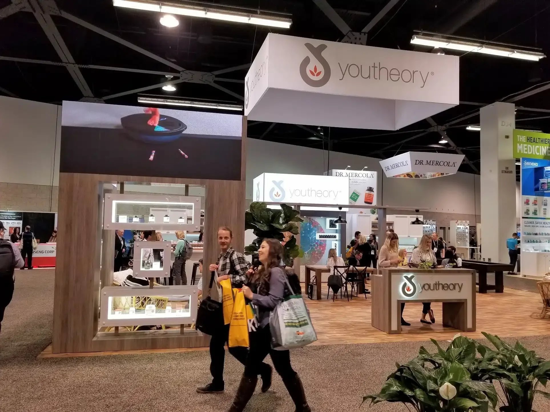
Picture this: two booths side by side at a major industry show. The first is a stunning display of products, lighting, and branding, yet visitors glance, grab a brochure, and keep walking. The second has a clear path, a compelling story, and staff who seem to know exactly what each visitor needs to hear. People linger, book meetings, and leave with a clear next step. The difference isn’t budget or flash; it’s design that follows the buyer journey instead of just showcasing features. When you build your exhibit around how attendees actually research, compare, and decide, your booth stops being a backdrop and starts functioning as a sales engine.
The buyer journey at trade shows (and why it matters)
At B2B events, attendees rarely arrive ready to buy on the spot. They move through stages: realizing a problem, exploring solutions, comparing suppliers, validating claims, and building internal consensus. A booth designed around these stages reduces friction, answers the right questions at the right time, and makes it easy for prospects to take the next step—whether that’s a demo, a meeting, or a follow-up call.
Research on booth psychology shows that layout, flow, and zoning directly shape emotions, trust, and buying decisions. When your exhibit mirrors the journey, you guide visitors from curiosity to commitment without overwhelming them or forcing a sales pitch too early.
Stages attendees move through (and how to design for each)
Use these five stages as your blueprint for spatial design, content, and staffing.
1) Awareness: “Do I have a problem, and is this relevant?”
In the awareness stage, attendees are scanning the floor, filtering for relevance, and looking for quick signals that a booth is worth their time. Your design should communicate clearly at three distances: at 30 feet they should understand your brand and category, at 10 feet they should grasp your core value proposition, and at 3 feet they should see proof and a clear call to action. Position bold visuals, live demos, or a sharp “we solve X” headline at the edge of the booth to create a curiosity zone that stops traffic. Keep entry low-friction with open sightlines, no barriers, and a simple invitation such as “See how [brand] cuts onboarding time by 40%.” Content should focus on one-sentence problem-and-solution messaging, and staff should be trained to ask qualifying, open questions like “What’s your biggest bottleneck with X right now?” rather than launching into a pitch.
2) Consideration: “What are my options, and how do they differ?”
Once visitors are engaged, they shift into consideration mode, comparing approaches, features, and outcomes while looking for differentiation and proof. Design a consideration zone deeper in the booth with product demos, comparison screens, case study walls, and interactive stations. Create a clear flow that moves visitors from attract to engage to convert, with demos visible from the aisle and a natural path inward. Put social proof in view through logos, metrics, short testimonials, and before-and-after visuals. Your content should include side-by-side comparisons against the status quo and common alternatives, and your staff should be ready to tailor demos to specific use cases and industries.
3) Evaluation: “Can this work for us, and can we trust these claims?”
In the evaluation stage, technical and financial evaluators dig into fit, integration, ROI, risk, and implementation. Create evaluation nooks with seated consultation areas, small meeting rooms, or semi-private pods for deeper conversations. Offer hands-on trials through sandbox environments, configuration tools, or guided “build your solution” interactives. Make proof assets available on demand via QR codes or tablets with spec sheets, security documentation, ROI calculators, and implementation timelines. Train staff to pivot from demo to discovery by discussing requirements, constraints, and success metrics, and provide clear next-step options such as booking a 30-minute technical deep dive, starting a pilot, or getting a custom ROI model.
4) Decision: “Is now the right time, and what’s the next step?”
Visitors in the decision stage are ready to move forward but need a clear, low-risk path such as a pilot, trial, meeting with leadership, or proposal. Design a commitment zone with a quiet area for final conversations, contract discussions, or executive meetings. Make conversion frictionless by integrating badge scanners, meeting schedulers, and simple forms into the demo flow, and display a visible CTA such as “Book your implementation roadmap session” or “Reserve your pilot slot.” Empower staff to book meetings on the spot and escalate hot leads immediately, and communicate clear timelines and ownership, for example, “You’ll hear from our solutions architect within 24 hours.”
5) Post-show: “Did I make the right choice, and what happens next?”
After the event, attendees reassess their choices, share notes internally, and weigh follow-up offers. Extend the experience beyond the booth with pre-show invites, VIP kits, and post-show thank-you packages that keep the relationship warm. Capture intent, not just contacts, by tagging leads according to their stage in the journey so follow-up messaging matches where they are. Deliver personalized follow-ups that reference the exact demo, concerns, and next steps discussed, and sequence content by stage so early-stage prospects receive educational material while late-stage prospects get ROI and implementation plans.
Practical blueprint: zoning your exhibit by journey stage
Map your floor plan to progression, not product categories. Create an attract zone at the front that is open, highly visual, and aisle-facing, with a big promise, live demo, or social-worthy moment. Build an engage zone deeper in the booth for consideration and evaluation, featuring demo counters, interactive stations, case studies, and comparison tools. Finish with a convert zone for decision-stage conversations, including seated areas, meeting rooms, badge scanning, scheduling tools, and a clear CTA. Allocate space for movement, aiming for around 60 percent of the footprint dedicated to flow, so visitors can move naturally from one stage to the next without bottlenecks.
Aligning staff behavior to the journey
Booth design only works if your team plays the same game. For awareness-stage visitors, validate challenges, offer simple explanations, and avoid heavy pitches. For consideration-stage visitors, highlight differentiation, show relevant examples, and tailor demos. For decision-stage visitors, discuss fit, timing, risk mitigation, and concrete next steps, and book meetings. Train staff to identify stage cues such as “We’re just exploring options” versus “We need to cut onboarding time this quarter,” and adjust their conversation path accordingly.
Measuring success by stage, not just “leads”
Shift your KPIs from raw badge scans to journey-aligned metrics. Track awareness through dwell time, engagement rate, social mentions, and QR scans of top-level content. Measure consideration with demo completions, case study downloads, and qualified conversations. Evaluate evaluation-stage success through technical deep-dive bookings, pilot requests, and RFPs initiated. Finally, measure decision-stage outcomes with meetings booked on-site, proposals sent, and opportunities created in your CRM. This approach makes it easier to prove ROI and optimize booth design show after show.
How to apply this to your next exhibit
Define your primary conversion action before design, whether that is a demo, meeting, pilot, or badge scan. Choose your conversion mode based on your sales cycle: discovery for education and meetings, demonstration for open demos and hands-on trials, or awareness for maximum visibility and frictionless capture. Wire your content and CTAs to each stage so visitors always have a clear “next step” that matches their readiness. Designing around the buyer journey doesn’t just make your booth look better; it makes it work harder at every stage of the attendee’s decision process.
