Why Simplicity Often Outperforms Overdesigned Activations
Most experiential activations are built to impress. Brands pour money into multiple screens, layered lighting, complex tech setups, and crowded visuals with the aim of impressing consumers. They assume more features means better results. But the opposite happens. People get confused. They stop moving. They walk away.
The brain doesn't work by choice. It works by shortcut. When someone sees an activation, they scan it in under three seconds. If the message isn't clear, they don't engage. Research shows that simple visuals are processed faster and remembered longer than complex ones. This is called processing fluency, and it's the difference between someone stopping to join or walking past without looking.
Four Examples Where Simple Ideas Can Deliver Big Results
Example 1: A Tactile Pop-Up Focused on Touch
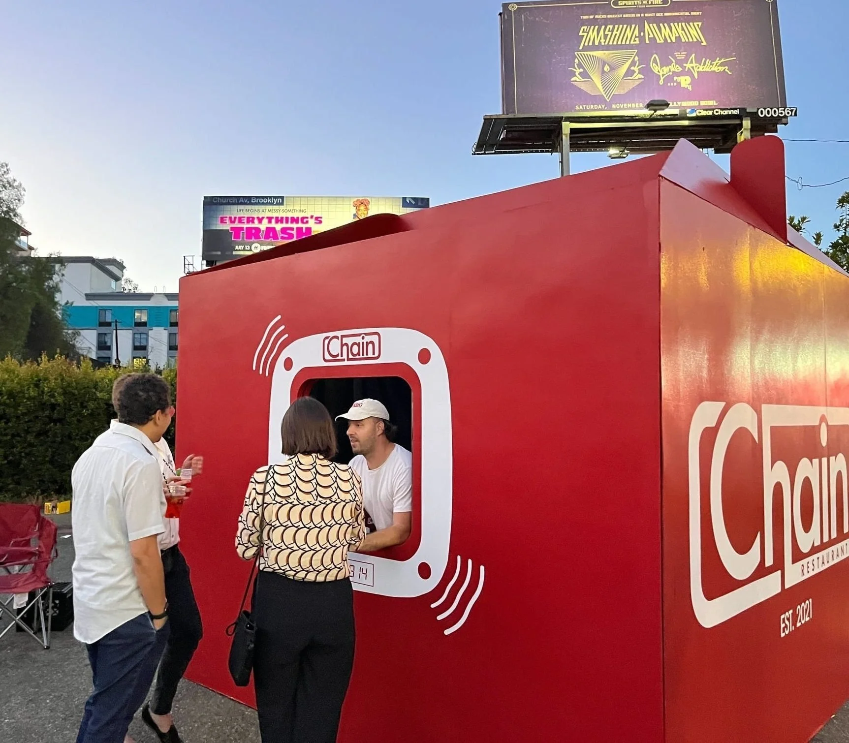
A plush toy brand can create a pop-up experience that doesn't use screens or tech. Instead, it can use soft textures, warm lighting, and one clear interaction: people can hold and touch the products. No instructions. No confusion. Just one feeling: comfort. The experience can become memorable because it is simple, human, and shareable.
Example 2: A Mirror Outside a Store
A sustainable fashion brand can place a single mirrored A-board outside their location. Passersby can stop, look at themselves, and take photos. The activation can need no tech, no builds, no staff training. Just one clear interaction that people understand instantly. Result: more foot traffic and organic social posts.
Example 3: A Customizable Bottle
A beverage company can let people customize their own product label. The idea can be simple: make it personal. The action can be easy: choose a name, scan, buy. Sales can increase by 2% in the U.S. alone. The campaign can become global because the concept is clear and the participation is frictionless.
Example 4: Sleep in a Store
A furniture brand can invite customers to sleep overnight in their store. The concept can be one sentence: sleep in our store. No complex setup. No tools needed. Just one memorable experience that can create media buzz and strengthen brand loyalty.
The Science: Why Simple Activations Work Better
Three research-backed principles explain why simplicity wins:
1. Processing Fluency
Simpler visuals are processed faster by the brain. When something is easy to understand, people feel more positive about it. They trust it. They remember it.
2. Hick's Law
The more choices you give people, the slower they decide. Every extra button, option, or screen adds friction. In experiential marketing, decision fatigue kills participation.
3. Decision Speed
Consumers have only a few seconds to understand an activation. If they can't see the message and the action within three seconds, they leave. Simple designs communicate faster.
Data from UX research supports this: single, focused CTAs increase conversion rates by up to 371%. Users complete tasks 50% faster on simple interfaces. When visitors immediately understand value, bounce rates drop. The same rules apply to physical activations.
Four Metrics That Show Simplicity Outperforms Complexity
When brands compare simple versus overdesigned activations, simple wins on all four measures:
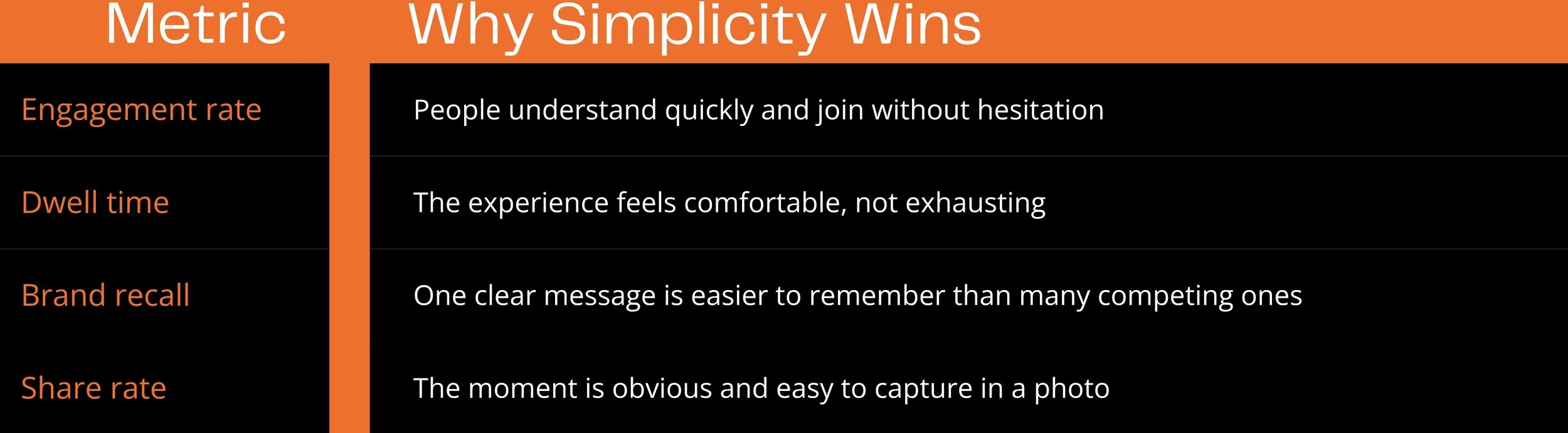
Less complexity means more results. The data proves it.
Simplicity Scales Better Across Locations and Budgets
Overdesigned activations depend on perfect conditions. They need specific tech, rare materials, and complex builds. When weather changes, crowds grow, or equipment fails, the experience breaks. Simple activations don't have this problem. Four advantages make them smarter for long-term strategy
Lower maintenance costs: less tech to break
Faster setup times: builds are lighter and simpler
Easier troubleshooting: problems are obvious and fixed quickly
Consistent results: the design works across different venues
Brands that choose simplicity can run more activations with the same budget. They can adapt when conditions change. Simplicity isn't basic. It's strategic.
How to Build a Simple Activation That Works
Start with two questions:
What's the one thing people should remember?
Answer it clearly. One sentence. One idea.What's the one action they should take?
Make it obvious. One step. One button. One path.
Build around those two answers. Remove everything else. Cut screens. Cut text. Cut steps.
Test before launch. If people hesitate, ask questions, or look confused, simplify more. Make it faster. Make it clearer. Make it easier. Great design doesn't make people say "wow, that's beautiful." Great design makes people say "wow, that was easy."
Simplicity isn't a trend. It's the smarter way to design experiences people want to join, remember, and share. Less complexity. More impact. Better results.