
Designing TikTok‑Ready Retro Photo Ops for Brand Activations
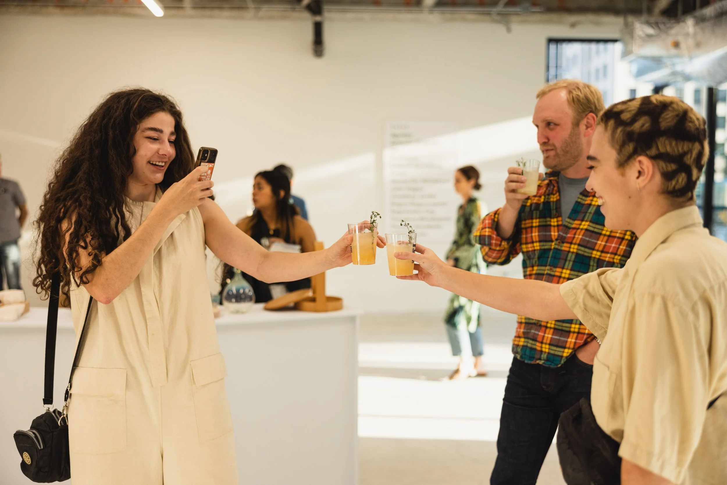
The best photo moments at brand activations in 2026 do not feel like photo booths. They feel like something your friends would send you at 2 a.m. with “OMG we need to do this” in the caption. That is the bar for TikTok-ready retro photo ops. The goal is to design experiences that look native to the feed, tap into nostalgic aesthetics, and make sharing feel automatic rather than forced.
Why Retro Photo Ops Are Winning on TikTok Right Now
TikTok has pushed a raw, unpolished visual language that favors authenticity over perfection. Gen Z and younger Millennials are drawn to formats that feel imperfect, human, and memory-coded. Disposable camera grain, VHS-style color shifts, and Y2K flash photography all fit this aesthetic. They signal “real moment” instead of “brand content.”
At the same time, nostalgia continues to drive engagement across social platforms. Retro visuals tap into shared cultural memories while feeling fresh when paired with modern music, captions, and editing styles. For brands, this creates a sweet spot: design photo experiences that lean into analog aesthetics but deliver vertical, mobile-first content optimized for TikTok’s 9:16 format.
The result is higher share rates, more organic UGC, and stronger earned impressions. Activations that get this right see guests posting within minutes, often with minimal prompting, because the content already looks like it belongs on their profiles.
Core Design Principles for TikTok‑Ready Retro Photo Moments
Start with vertical by default. Every capture should be framed for 9:16 from the outset. Horizontal photos or square booths that require cropping later lose impact and reduce the likelihood of sharing. Design backdrops, lighting, and props so the strongest composition happens naturally in vertical orientation.
Lean into analog textures without going full museum. Think film grain overlays, slight color bleeding, soft focus, and flash-heavy lighting that mimics point-and-shoot cameras from the early 2000s. Avoid over-stylized filters that look like a generic app preset. The aim is “shot on a forgotten disposable” not “vintage filter #17.”
Keep the set simple and editorial. Clean backdrops, strong color blocks, and minimal props outperform cluttered scenes. TikTok users respond to moments that look intentional but not over-produced. A saturated pink wall with a single neon sign, a checkerboard floor with a retro boombox, or a mirror framed with fairy lights and stickers can all become iconic backdrops when lit correctly.
Build in motion. Static photos still work, but short video clips, slow-motion loops, and flipbook-style sequences generate more saves and shares. Even a three-second clip of someone laughing while holding a product in front of a retro backdrop can outperform a polished portrait. Design the space so movement feels natural and the camera captures it cleanly.
Make the tech invisible. Guests should not feel like they are interacting with a kiosk. QR codes should trigger instant delivery to phones without forcing app downloads or long forms. If you use AI enhancements, keep them subtle: slight film emulation, dynamic text overlays with the event name or date, or personalized captions that appear as the content loads.
Staffing and Flow for High-Volume Retro Photo Zones
Photo ops that go viral on TikTok are rarely accidental. They are staffed and sequenced to maintain energy, quality, and throughput. A practical baseline for UGC-focused activations is one brand ambassador per 25 attendees in the photo zone. This ratio gives enough guidance to help guests find their angle, understand the call-to-action, and feel comfortable creating content without hovering.
For high-traffic festivals or retail pop-ups, plan for one active staff member per 75 to 100 visitors per hour at the photo station. This keeps lines moving, ensures props and lighting stay intact, and allows staff to reset the scene between groups. During peak hours, add a floating ambassador to manage queues, troubleshoot delivery issues, and encourage tagging without slowing the experience.
Lighting and backdrop maintenance matter more than you think. Retro aesthetics rely on specific color tones and contrast. Overhead fluorescents or mixed lighting can break the illusion. Use controlled LED panels with warm or cool gels to match the desired era, and assign a staff member to wipe down mirrors, replace props, and check that branded elements stay visible in frame.
Turning Photo Moments Into Owned Data and Follow-Up Sequences
The photo is the hook. The data capture is the handoff. Use QR-code check-in at entry to the photo zone, mid-experience survey triggers for longer activations, and a post-experience SMS or email prompt sent within 15 minutes of departure. This window captures guests while intent is highest and links their content to your CRM.
Encourage tagging with clear but light prompts. A small sign that reads “Tag us to be featured” or “Show us your retro fit” performs better than aggressive CTAs. Offer a reason to share beyond the photo itself: entry into a giveaway, access to a shared gallery, or a discount code that unlocks after posting.
Layer in brand lift measurement where possible. In controlled environments like pop-ups or brand houses, compare exposed attendees who used the photo zone to a matched control group on metrics like awareness, favorability, and purchase intent. In open-field settings, rely on qualified interactions, sentiment notes from staff, and lift studies that survey attendees pre- and post-exposure.
Real-World Concepts That Work Without Feeling Forced
A disposable camera corner with branded film sleeves and a “drop off for develops” wall that delivers digital scans via QR code within 24 hours. A Y2K flash booth with a checkerboard floor, neon signage, and instant vertical delivery that auto-adds the event hashtag. A mirror selfie station framed with stickers, fairy lights, and a ring light that mimics bedroom content but with controlled branding in the reflection.
Each of these concepts leans into retro aesthetics while delivering modern, mobile-first output. They feel like moments guests would create on their own, just elevated enough to be consistently on-brand and share-ready.
The Bottom Line for Experiential Teams
TikTok-ready retro photo ops win when they feel native to the platform, not like a brand trying to act cool. Design for vertical, embrace analog textures, keep sets simple, and build in motion. Staff for quality and throughput, then link the moment to data capture and follow-up sequences that extend the value beyond the event.
The brands that get this right will stop chasing viral moments and start designing them into the activation from day one. They will create photo experiences that guests want to share, measure what actually moves the needle, and walk away with content that works as hard after the event as it did during it
